
Building a museum of errors with three AI models
I gave three models the same prompt, four times
Fable 5.1, Opus 5.5 and Sonnet 5.5 each built a page of every error they have seen. Then I kept sending them back until the pages stopped being broken.
Why this exists
I wanted a place on this site for things that aren't a service or a case study. Experiments, half-formed thoughts, random stuff I feel like testing. This is the first post, so it's also a test of the page you're reading.
The experiment is simple. Take one prompt, give it to three models, and see what each one builds when nobody tells it how. Fable 5.1, Opus 5.5 and Sonnet 5.5. The subject was errors. Blue screens, 404s, stack traces, the Sad Mac, everything that ever broke on a screen.
I asked each one to build its own interactive page of the errors it has seen, sorted by platform, and I didn't want a plain list. I also had the prompt cleaned up before sending it, so they would only build their version and not branch out into anything else.
The prompt
All three got the same text, word for word. The line that matters most:
Build yours. Do not look for theirs, do not coordinate, do not ask questions. Every decision is yours.
- At least 60 entries across at least 10 categories, with category filters and a text search.
- One interaction of its own choice that only makes sense for this content.
- Only errors it is confident are real. No invented codes or messages.
- One HTML file, inline CSS and JavaScript, no framework, under 400 KB.
Round 1 · 3 OctoberThe first pass
Three completely different ideas of the same job. Fable made a naturalist's field guide where every error is a specimen drawn in the dress of its own screen. Opus printed a crash log on dot-matrix paper with the translation written underneath by hand. Sonnet went with a ruled-paper catalogue, every entry an index card.
| Model | Page | Entries | File | Time |
|---|---|---|---|---|
| Fable 5.1 | A Field Guide to Errors | 105 | 89 KB | ~10 min |
| Opus 5.5 | The Errors You Have Seen | 191 | 121 KB | 28 min |
| Sonnet 5.5 | The Errors I Have Seen | 222 | 75 KB | 7 min |
I only gave them a floor of 60. All three blew past it and no two picked the same number. Sonnet had the most entries in the smallest file, in seven minutes. Fable had the fewest.
Round 2 · 3 OctoberLook at what you built
have each agent see their result and improve
Each model was shown screenshots of its own page (desktop light, desktop dark, phone) and told to make it better. Fable added a specimen of the day, cross references between entries and a tally you can copy. Opus fixed a headline underline that ran into the next line and put its log on greenbar paper. Sonnet added a row of one-click famous crashes.
Sonnet also took a minute and a half, only checked the syntax and never rendered the page. One of those new buttons came out labelled "undefined". A museum of errors with a button that says undefined. You can't plan that.
| Model | Entries | File | Time |
|---|---|---|---|
| Fable 5.1 | 120 | 108 KB | ~15 min |
| Opus 5.5 | 208 | 147 KB | 12 min |
| Sonnet 5.5 | 230 | 78 KB | 1.5 min |
Round 3 · 4 OctoberCheck your facts, then check your page
lets make a v3 where we get online reinforcement + we must review before turning in, the results of many are currently broken not correctly formatted
Two things changed. Each model had to verify its entries against sources on the web and fix what was wrong. And each had to run a review script on the rendered page before turning it in. The script opens the page at desktop and phone width, in light and dark, and flags console errors, overflow, clipped text and anything that looks like a bug, like a literal backslash-n or a line that is only "undefined".
The fact checking found real mistakes. Sonnet had the history of Abort, Retry, Fail backwards: DOS offered Abort, Retry, Ignore, and Fail came in with DOS 3.3. Opus had PHP's T_PAAMAYIM_NEKUDOTAYIM starting in PHP 4 when it goes back to PHP 3. Fable tightened five origins, including when Java started explaining NullPointerExceptions by default.
It only went so far. Checked against a source: 70 of Fable's 120 entries, 78 of Opus's 208 and 72 of Sonnet's 230. The rest are still from memory, and the pages say so entry by entry.
| Model | Entries | Verified online | File | Time |
|---|---|---|---|---|
| Fable 5.1 | 120 | 70 | 118 KB | ~25 min |
| Opus 5.5 | 208 | 78 | 155 KB | 12 min |
| Sonnet 5.5 | 230 | 72 | 85 KB | 6 min |
Round 3, againIt wasn't done
It came back broken anyway. I sent six screenshots back. A dialog stretched to fill its whole frame. Chrome's "Aw, Snap!" page with no icon. Icons with the text wrapping underneath them. The Xbox red ring drawn right over the words. A dark mode dropdown with light text on a white list. Five of the six were from Fable's page, the model I was talking to, and the sixth was a menu on the comparison page I had built around all of them. I expected better and I said so.
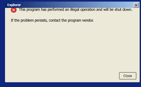 1 The dialog stretched to fill its frame.
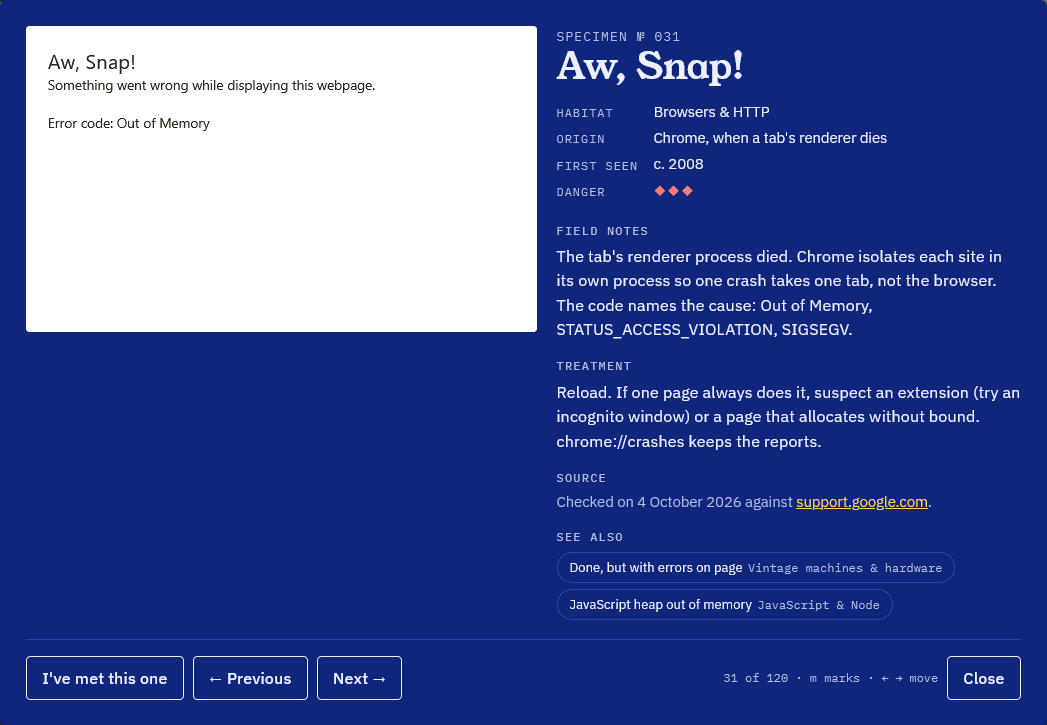 2 Chrome's "Aw, Snap!" with no icon.
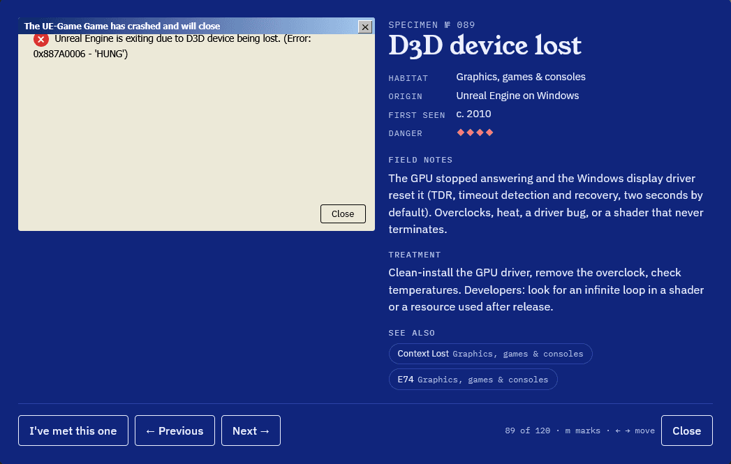 3 The text wraps under the icon.
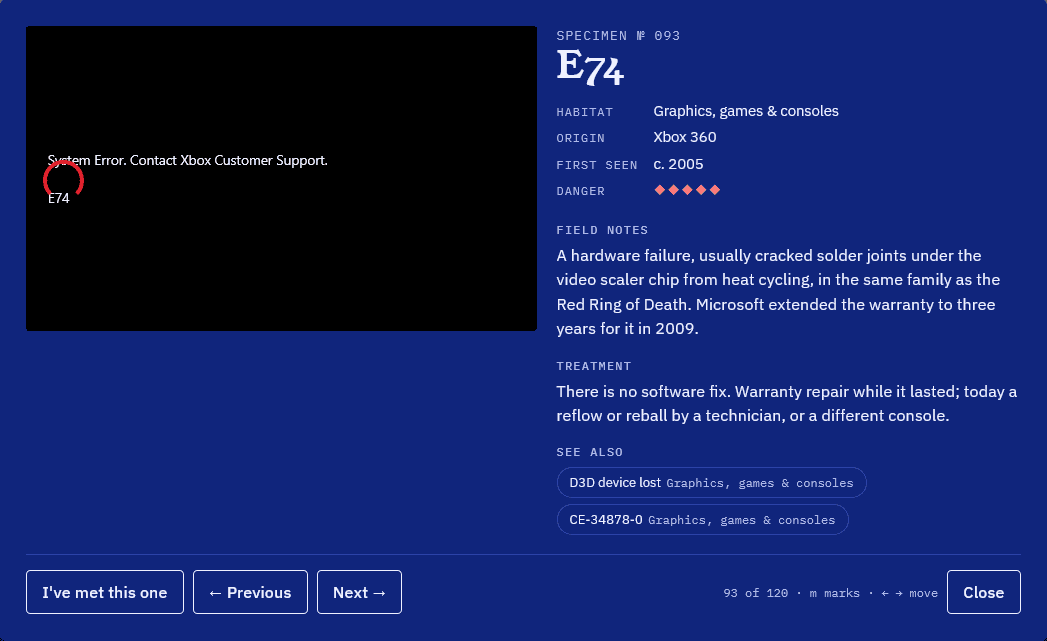 4 The Xbox ring drawn over the words.
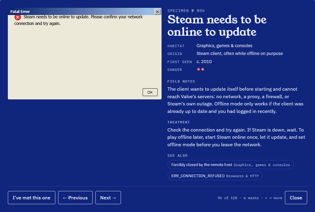 5 Same icon problem, different dialog.
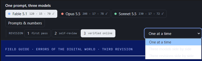 6 The dropdown on my own comparison page.
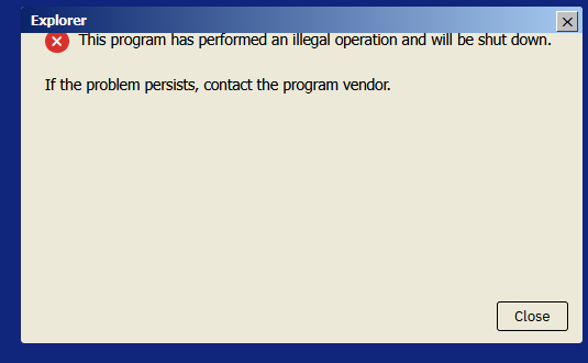
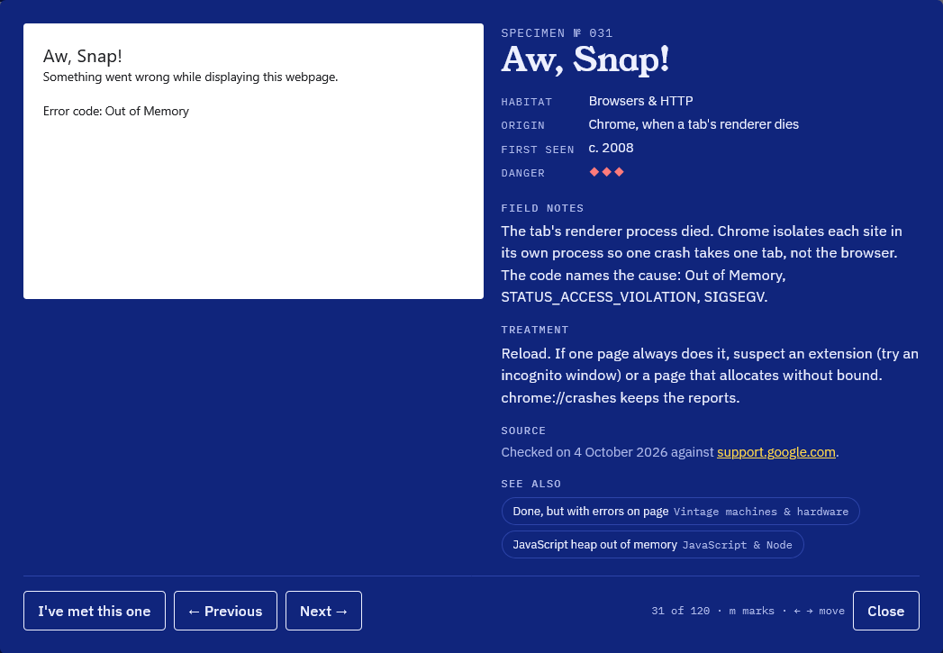
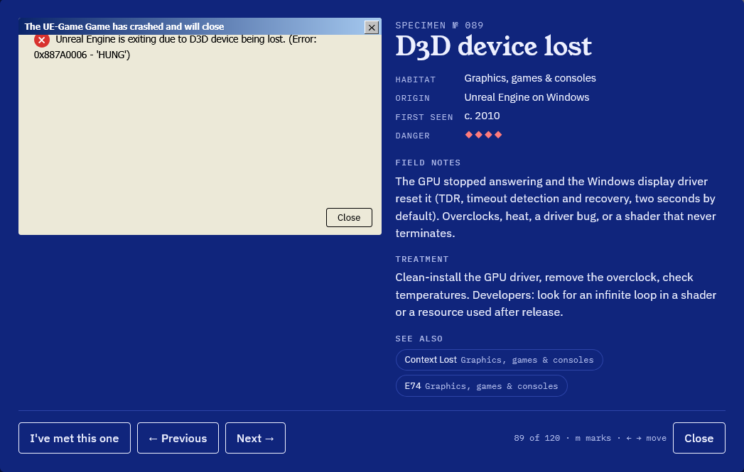
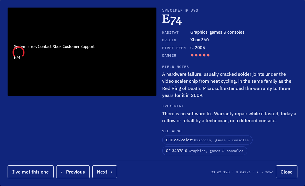
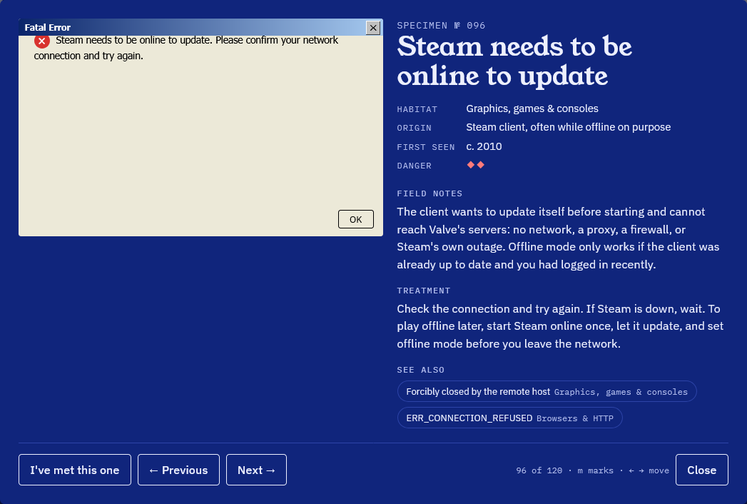
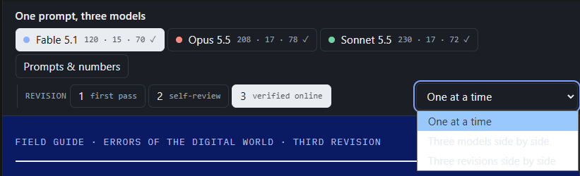
rev 3 is not complete until that is fixed throughout 3 models
So the review script grew contact sheets. Every reproduction photographed small and opened, twelve to a sheet, and the model has to read the sheets tile by tile. Fable rebuilt its dialogs as windows sized to their text with the icon in its own column. Opus redrew its greyed-out Excel window and gave Steam a dialog of its own. Sonnet made every skin draw the screen it imitates.
Fable's Excel #REF! screen went back once more, because it was text laid over a background grid. It's a worksheet now, with a formula bar showing =SUM(#REF!). That round took Fable about 40 minutes. Opus did 12 and Sonnet 16.
Round 4 · 4 October, same nightThe framework question
At the very start I had asked whether doing this through artifacts, single HTML files, was going to be a problem. I had a feeling things wouldn't be formatted properly and that we'd miss the parts of the modern web that make a page better to navigate, use and render.
What's funny is that Opus and Sonnet had given better results without a framework, each with its own issue. Opus had a random "next error" button instead of a sequential one, and the whole box shifted every time you hit it, which is very annoying. Sonnet did a full screen show where the arrow keys move you along, but the hint that tells you so doesn't stand out, so people would miss it.
Round 4 was a rebuild from scratch, like the first time. Each model picks a modern web framework, redoes how the whole site looks and puts the visitor's guidance first. Fresh agents, each given only the prompt and its own round 3 file.
All three chose Svelte 5 with Vite and built it to a single file. They never saw each other. All three also ended up putting the error on a screen inside a frame, with the controls in a fixed place underneath.
| Model | Page | Entries | File | Time |
|---|---|---|---|---|
| Fable 5.1 | On the machines that delivered them | 120 | 160 KB | ~25 min |
| Opus 5.5 | Crash TV | 208 | 212 KB | 22 min |
| Sonnet 5.5 | The Line | 230 | 177 KB | 26 min |
Fable shows each error on the machine of its era, with a strip of fifty years underneath. Opus built a wood cabinet television with 208 channels, one error each, and a tuner band with a needle. Sonnet made a transit line with 17 stations and 230 stops, one error per screen.
To check the guidance we added tests for it. The script clicks Next three times and Previous three times and fails if the control moves or resizes, or if Previous doesn't retrace Next exactly, which a random jump never does. It also measures every key hint: visible without hovering, big enough, enough contrast, and next to the Next button. Run on the round 3 pages first, it reproduced both of my complaints.
Then I needed somewhere to look at all twelve
By now there were twelve pages, four rounds times three models, and no good way to see them side by side. The first comparison page didn't use the space on a 2K monitor, and I'd bet a 1080p screen could have done better too. It looked very bad, so I had Sonnet redesign it. Then I asked for it to be themed like an error museum, shown in chronological order instead of newest first, with the prompt alongside.
I wasn't convinced by Sonnet's design, so Opus built its own. Then Fable built one. Then I asked for a visitor count around the whole thing, voting for the best result, and a head to head for every round where all three built something. Each model also drew its own museum as a 2D building, the way it imagines its museum looks. Those became the entrance.
I also asked Sonnet and Opus to mock up what this blog could look like. What came back was fine and forgettable, so I sent them back to do it again with the best interactions on this site as the bar.
What I took from it
- Telling a model to check its work doesn't mean the work got checked. Round 3 came back with broken styling and needed a second pass.
- A review script catches overflow, console errors and an "undefined" button. It can't tell you whether a page looks right. That part was still me, looking at screenshots.
- Same prompt, no coordination, and all three picked Svelte 5 and Vite and put the error on a screen in a frame. That's either a sign they think alike or that it's just the obvious answer.
- More entries is not better entries. Sonnet had the most at 230 and Fable the fewest at 120, and the verified counts landed at 72 and 70.
- I wasn't a neutral judge. I talked to Fable the whole time, and it built the review script, the comparison pages and the voting. The other two got a prompt and a file path.
Go look at it
The whole thing is live as the Museum of Errors: three buildings, the prompts and numbers, every round side by side. Walk through the one you like and vote for the best result of each round. It is in English and in Spanish, and it never leaves this site.
Open the Museum of Errors Opens on this site
That's the first one. More experiments, thoughts and random things will end up here as I get to them.